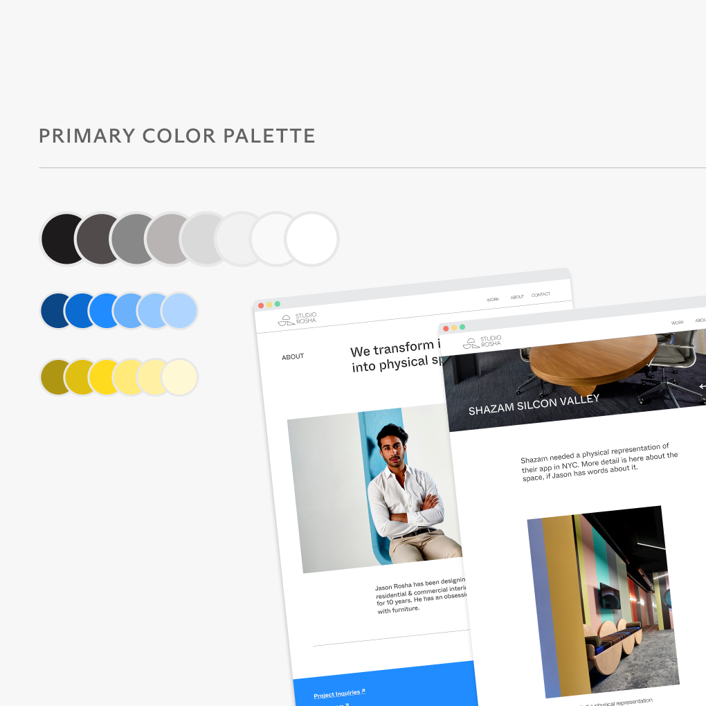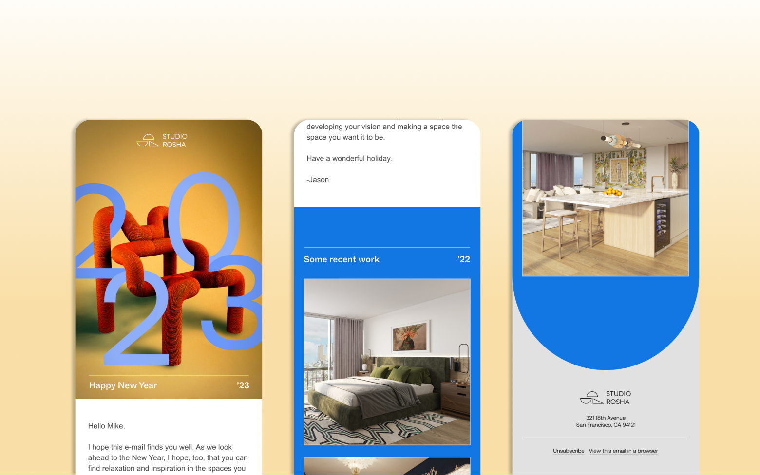
I led the design and research for Studio Rosha’s new website and marketing plan. Jason Rosha, the practice’s principle designer, needed a new web presence that would balance his taste—more high-brow and esoteric—with the reality of his market: well-off professionals in the Bay Area who have more everyday sensibilities.
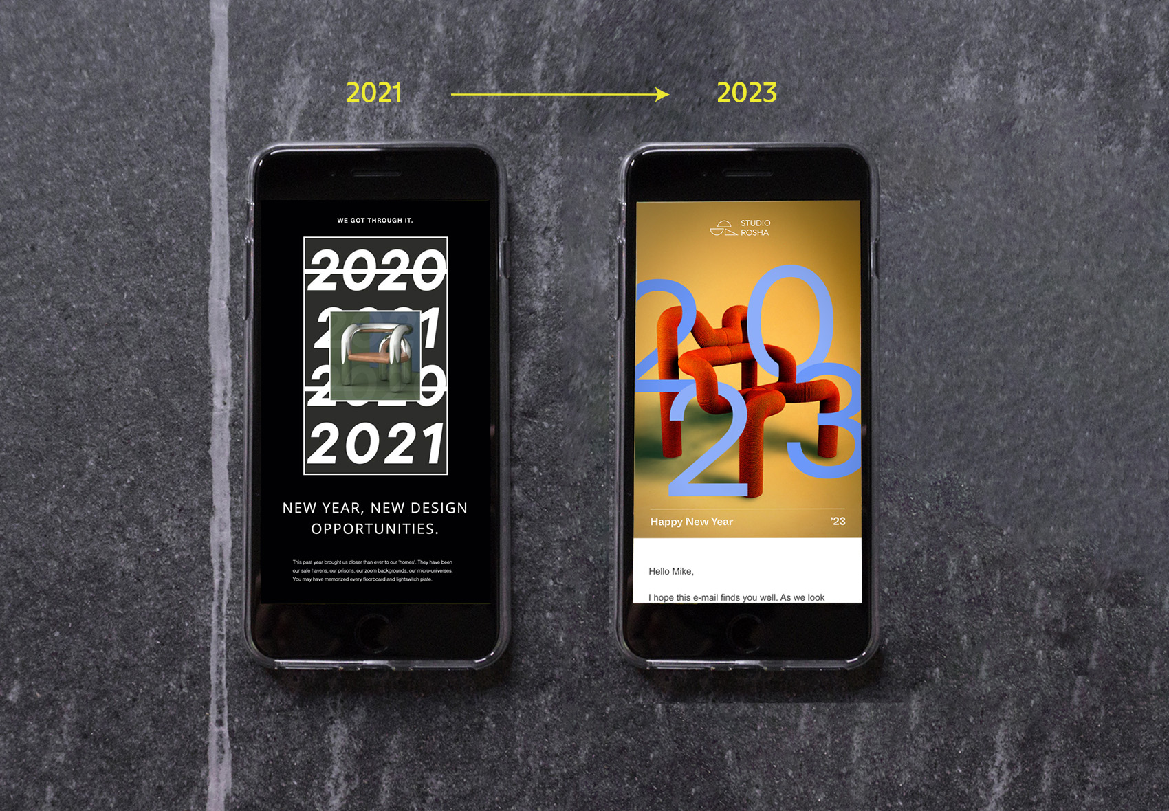
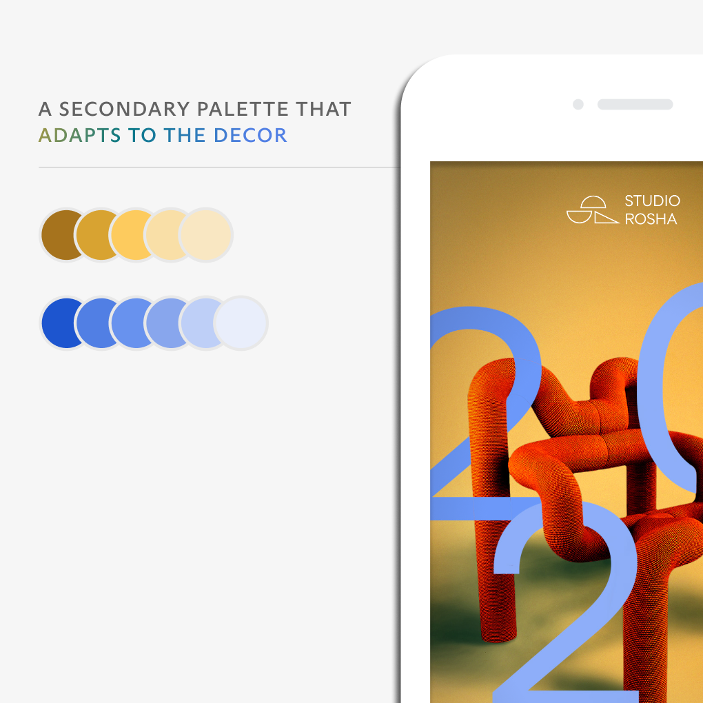
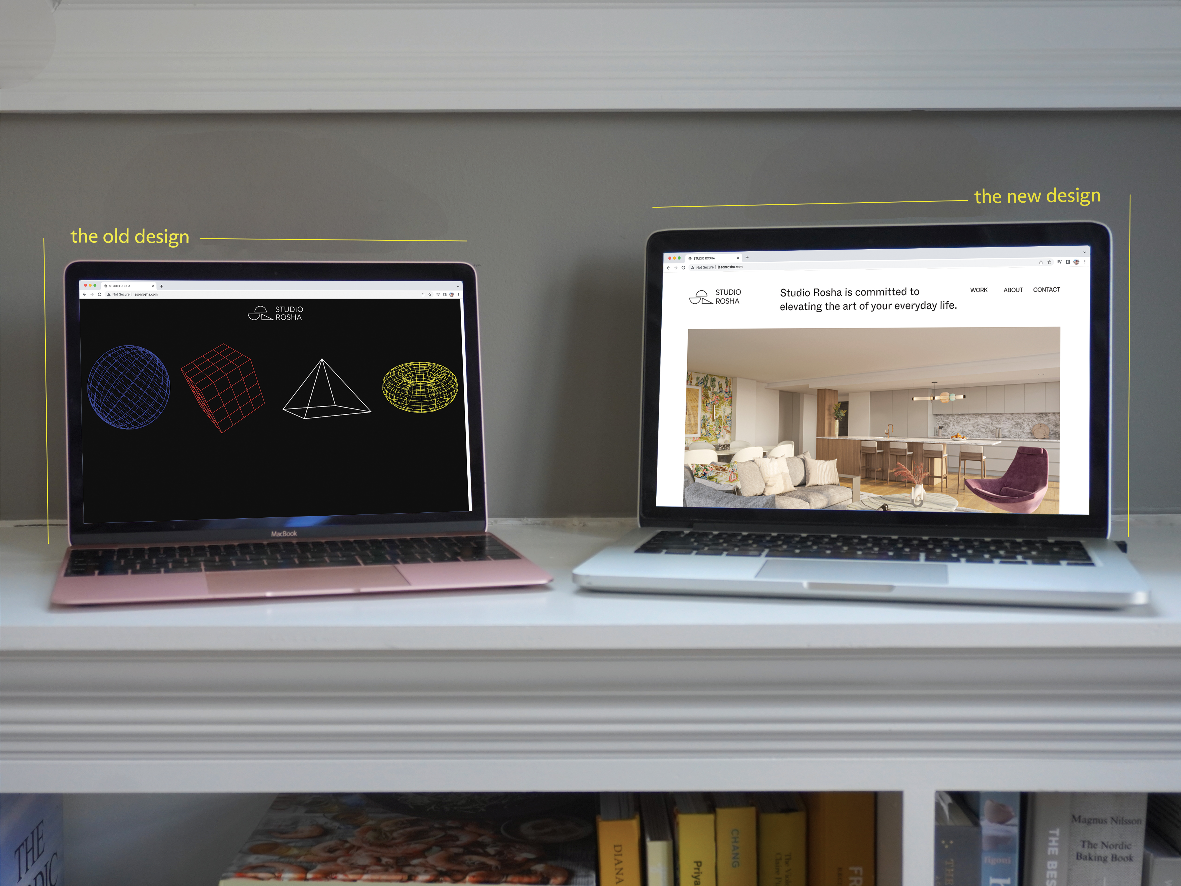
While Studio Rosha’s original aesthetic (left) registered as “cool”, the black on his home page and marketing materials was too heavy for a broad audience. I re-designed his brand identity to bring in a lighter palette while maintaining the hip aesthetic (right) that Mr. Rosha wanted to communicate.
