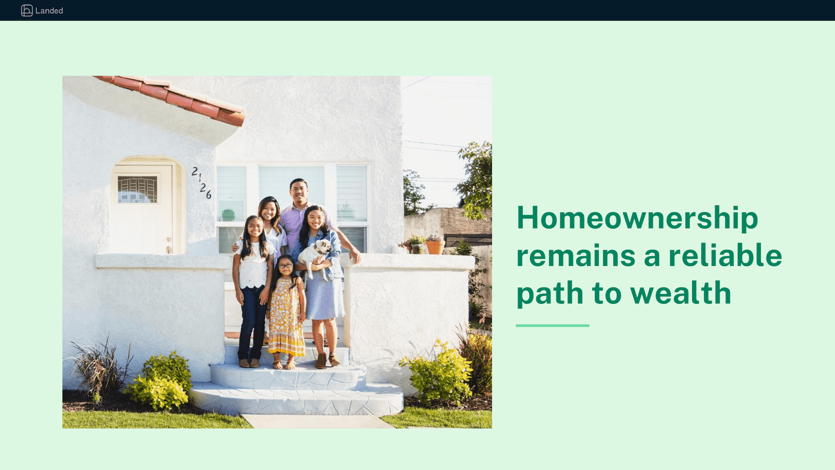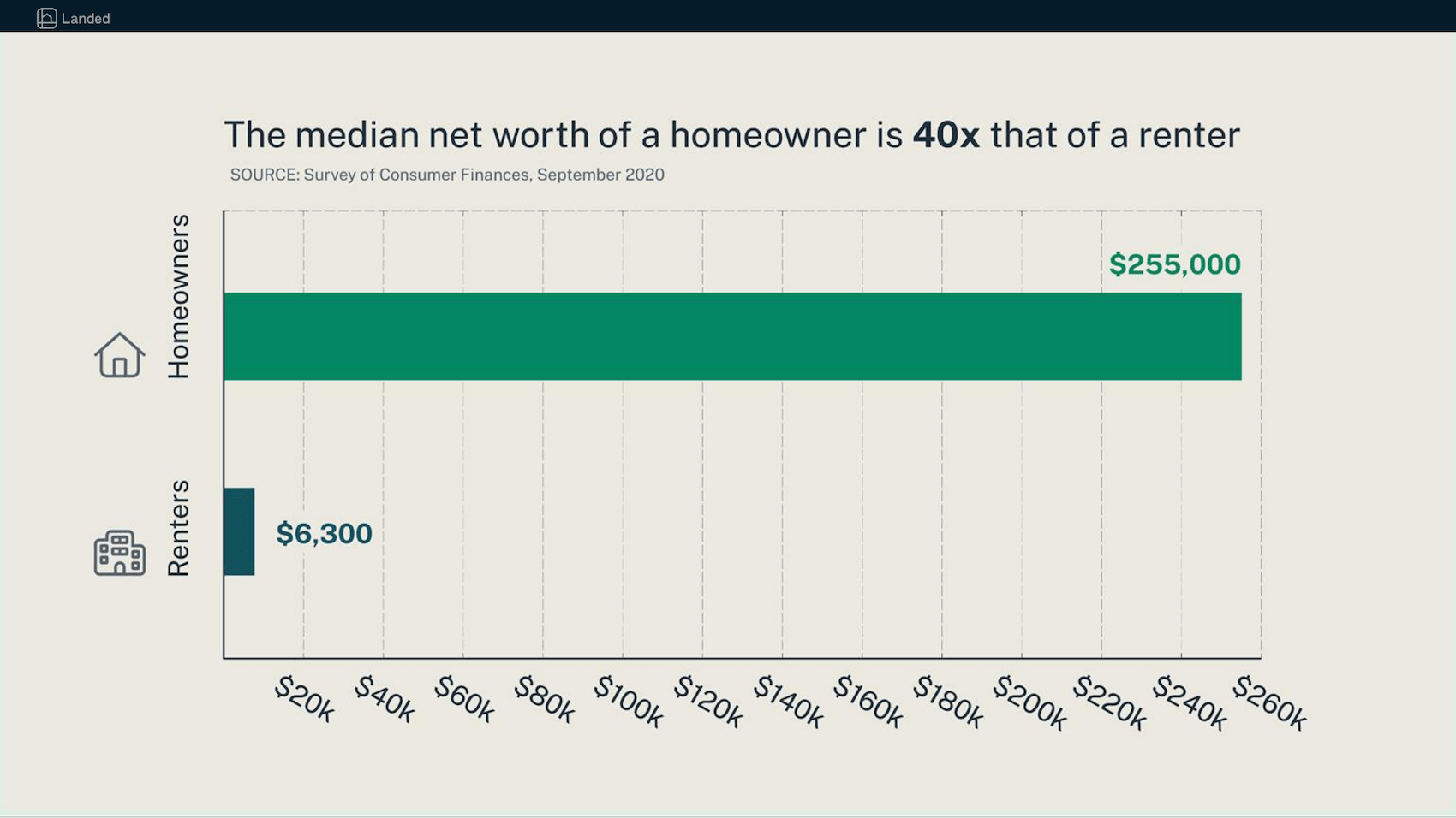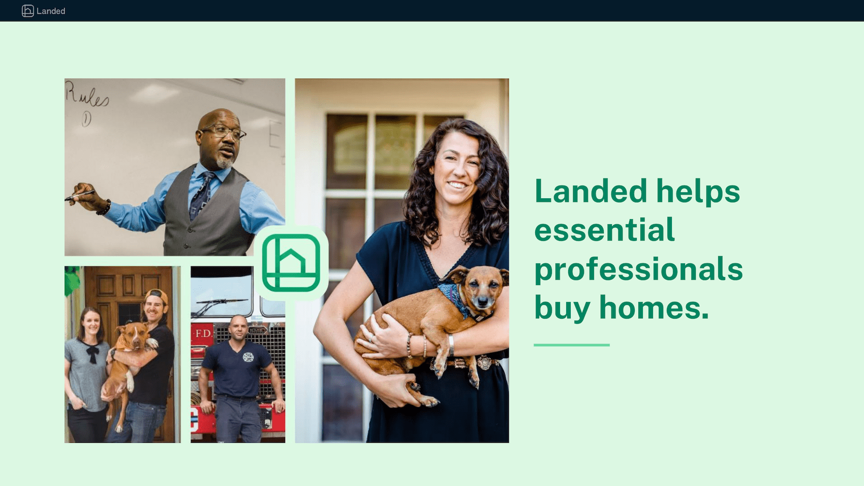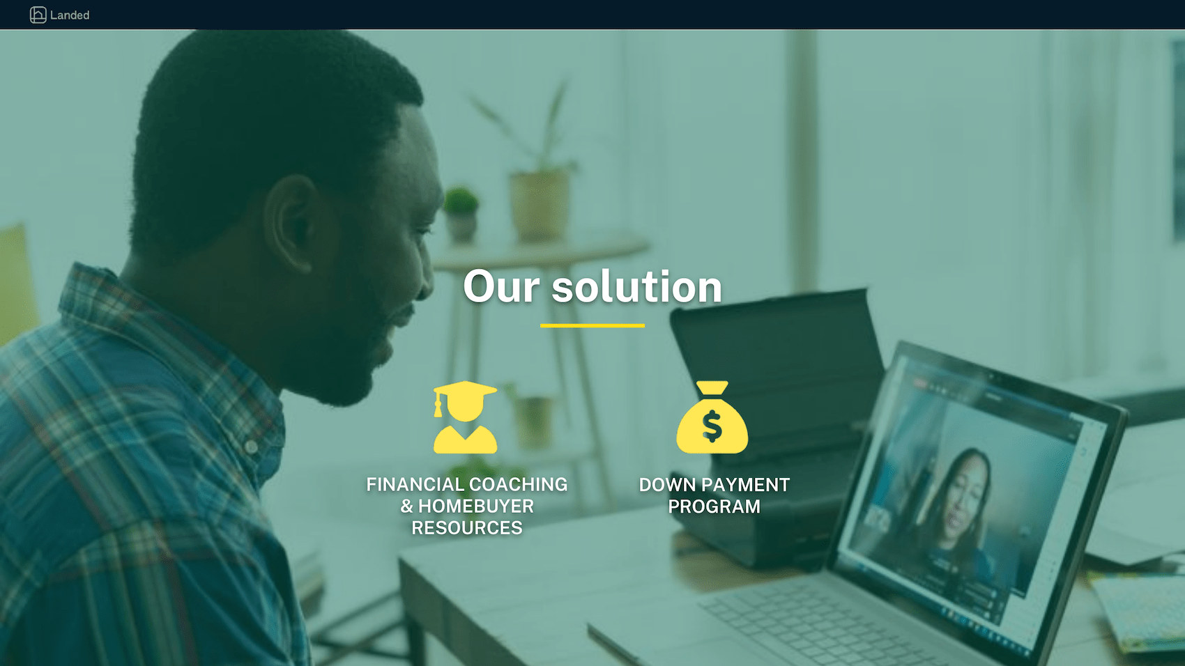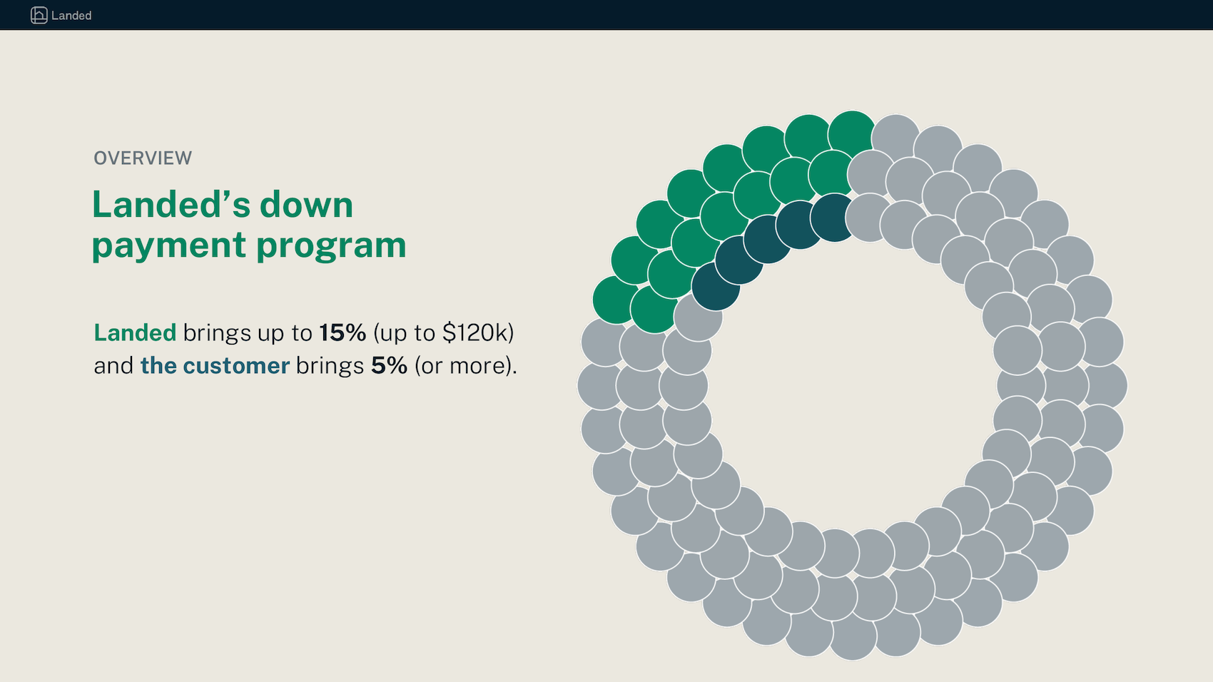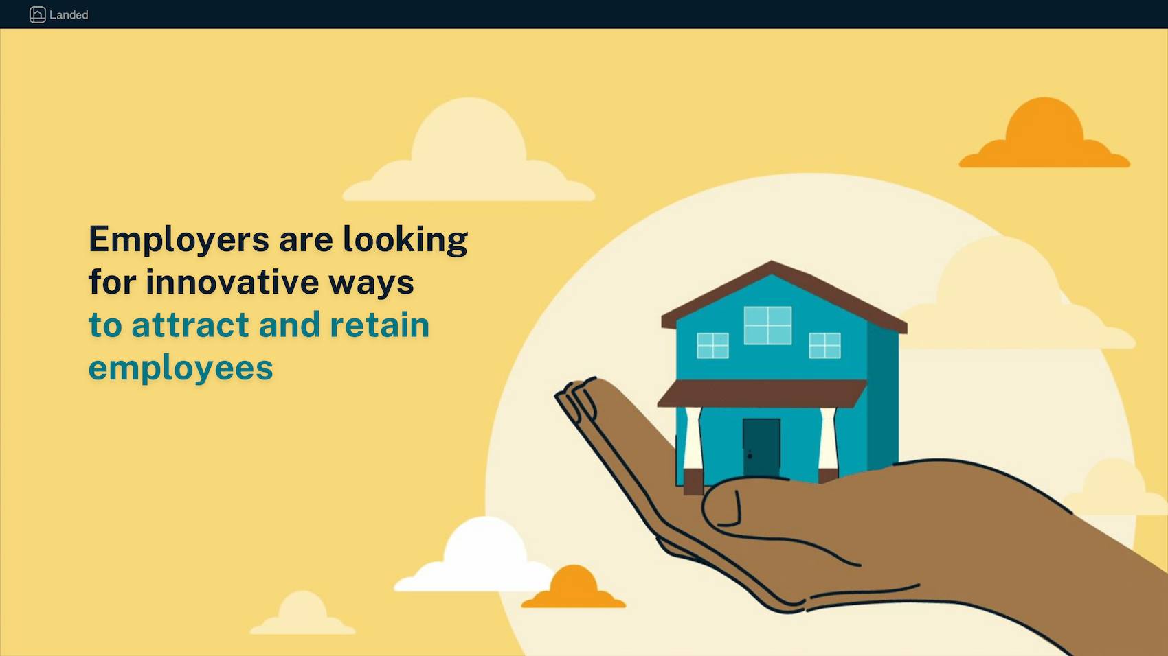
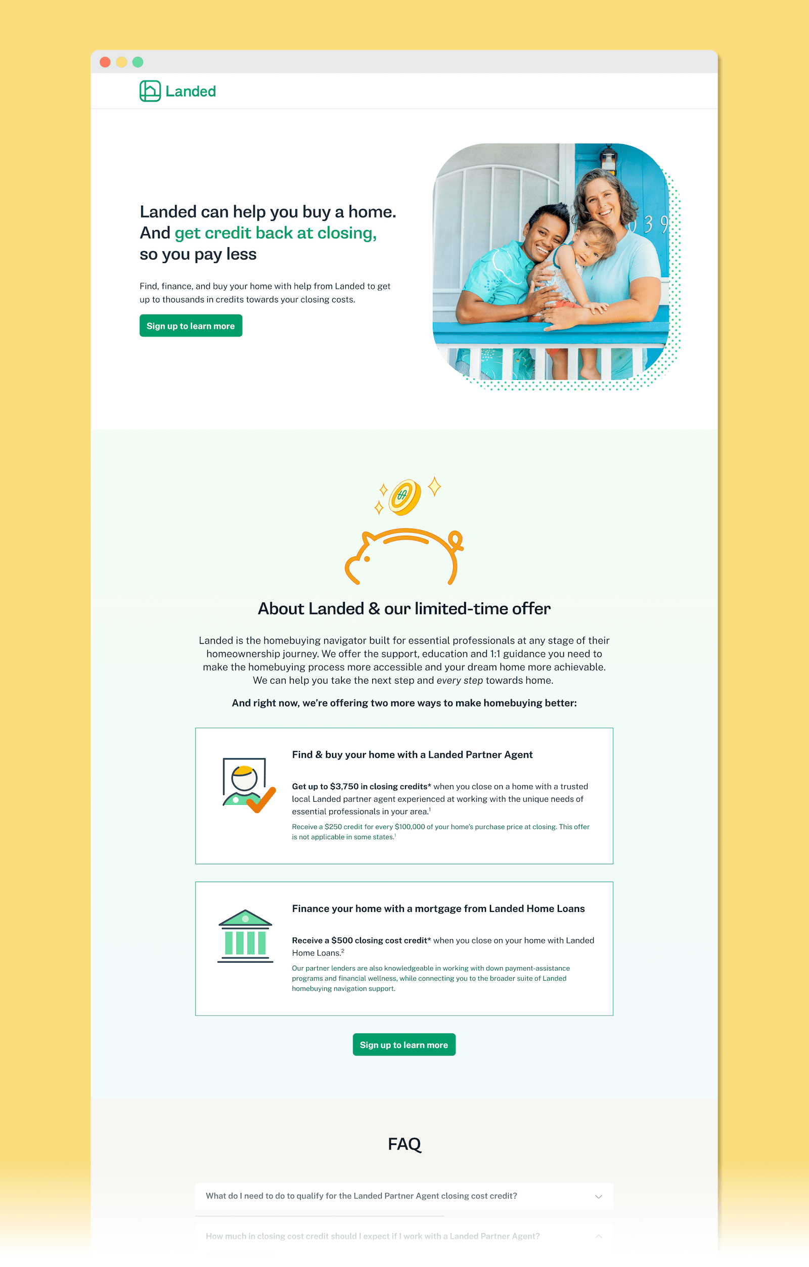
Homebuying is more than a significant financial investment; it's an emotional experience as well. At Landed, we wanted specifically to help essential professionals through that process. When I joined the company in April 2022, our core product was down payment support: Up to $120k toward an eligible customer’s down payment.
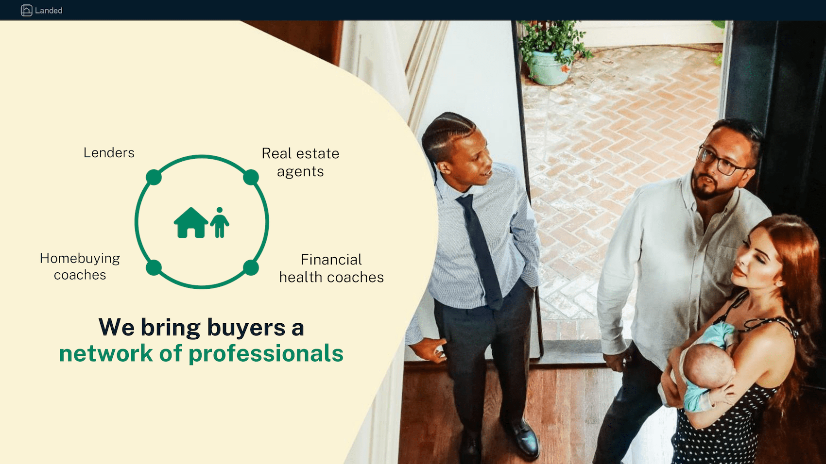
As interest rates rose this past summer and investors became nervous about the housing market, we ran out funds for our down payment program. So, we had to pivot: Landed became the "homebuying navigator" for essential professionals. In other words, Landed 2.0 would educate essential professionals on the homebuying process and connect them to the resources they needed to buy a home.
The work below includes my executions of that new product and brand positioning, as well as marketing materials that I developed to help Landed earn more investors and funding.
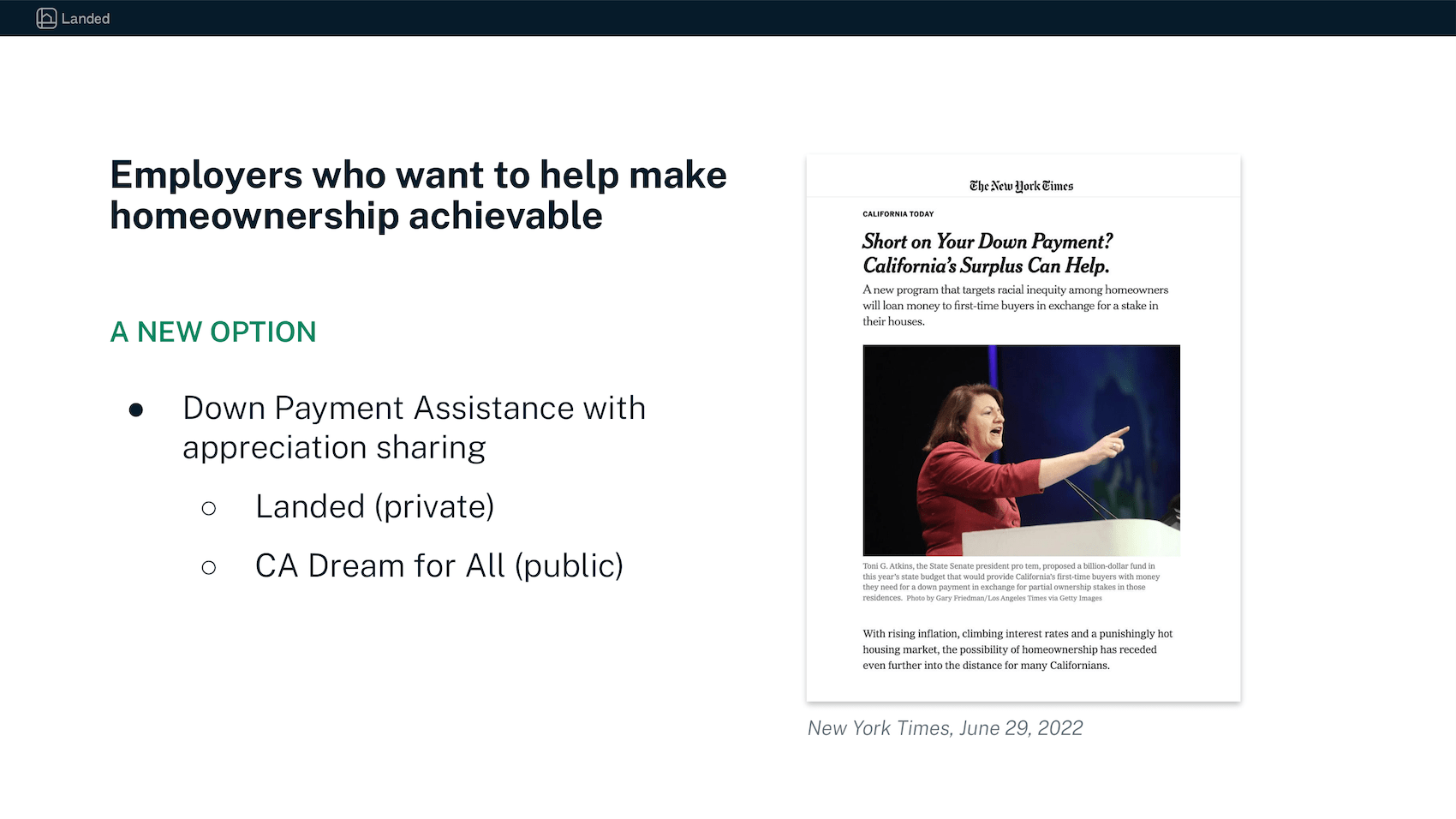
My work for our White Label campaign was a blend of strategy, product design, and marketing design. As the company sought alternative sources of funding, we pitched our digital infrastructure to the state of California.
The dashboard above was a hypothetical product that I designed for the purposes of these pitches. California planned to administer a program similar to our down payment program, and so I designed a digital interace that showed off our portfolio management capabilities.
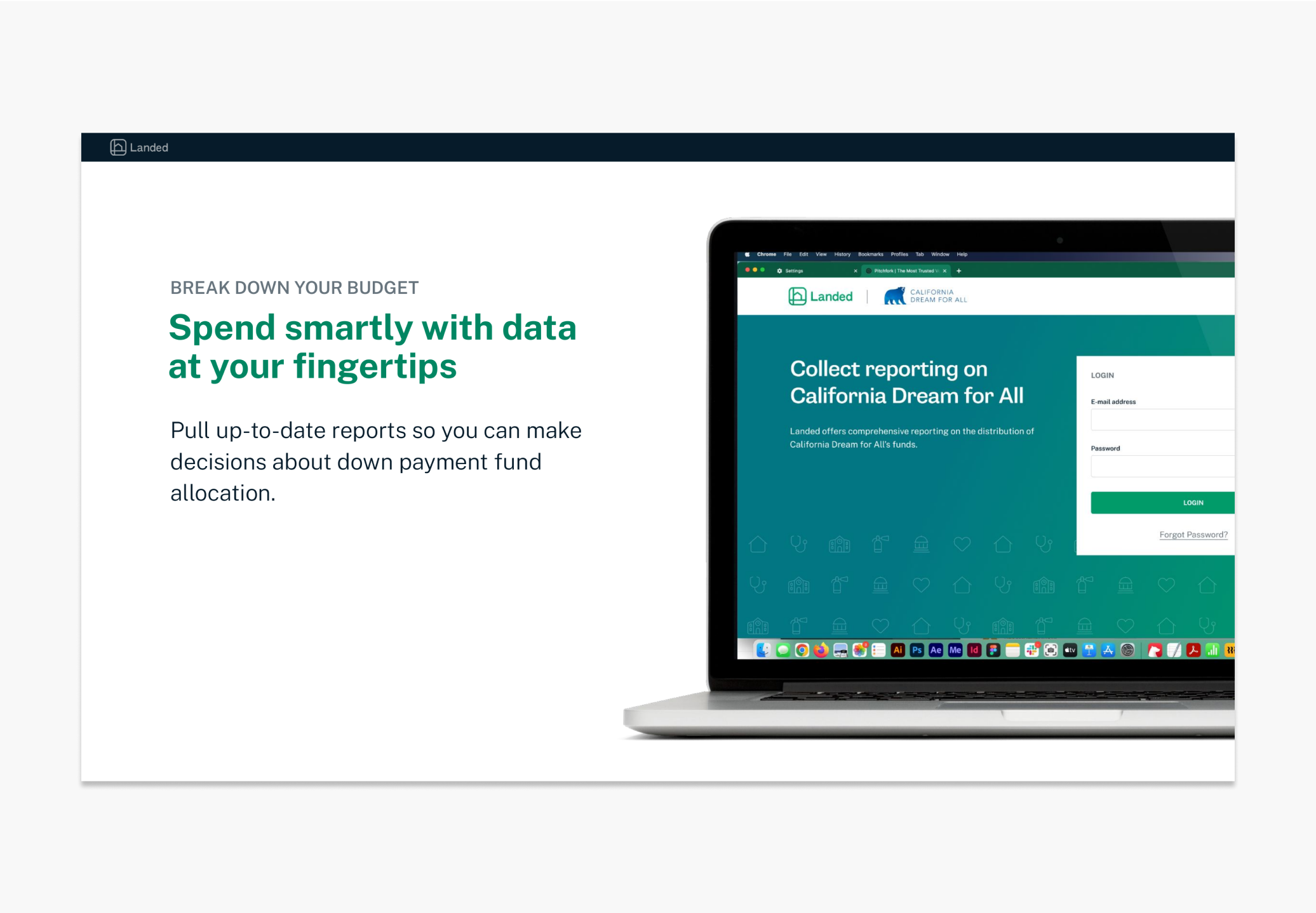
Perhaps the greatest challenge here was balancing the sophistication of product design with the speed of our marketing plan. A dashboard of this power would require deep thinking and months of development. I had just two weeks to prepare something that was both shippable and yet light enough on detail that I could successfully complete marketing materials on our tight deadline.
Ultimately, I was able to produce a dashboard our CPO endorsed and a deck that our Investments Team could pitch to state representatives.
I designed visuals and wrote copy for several marketing campaigns at Landed: banner ads, landing pages, e-mails, video animations, and more.
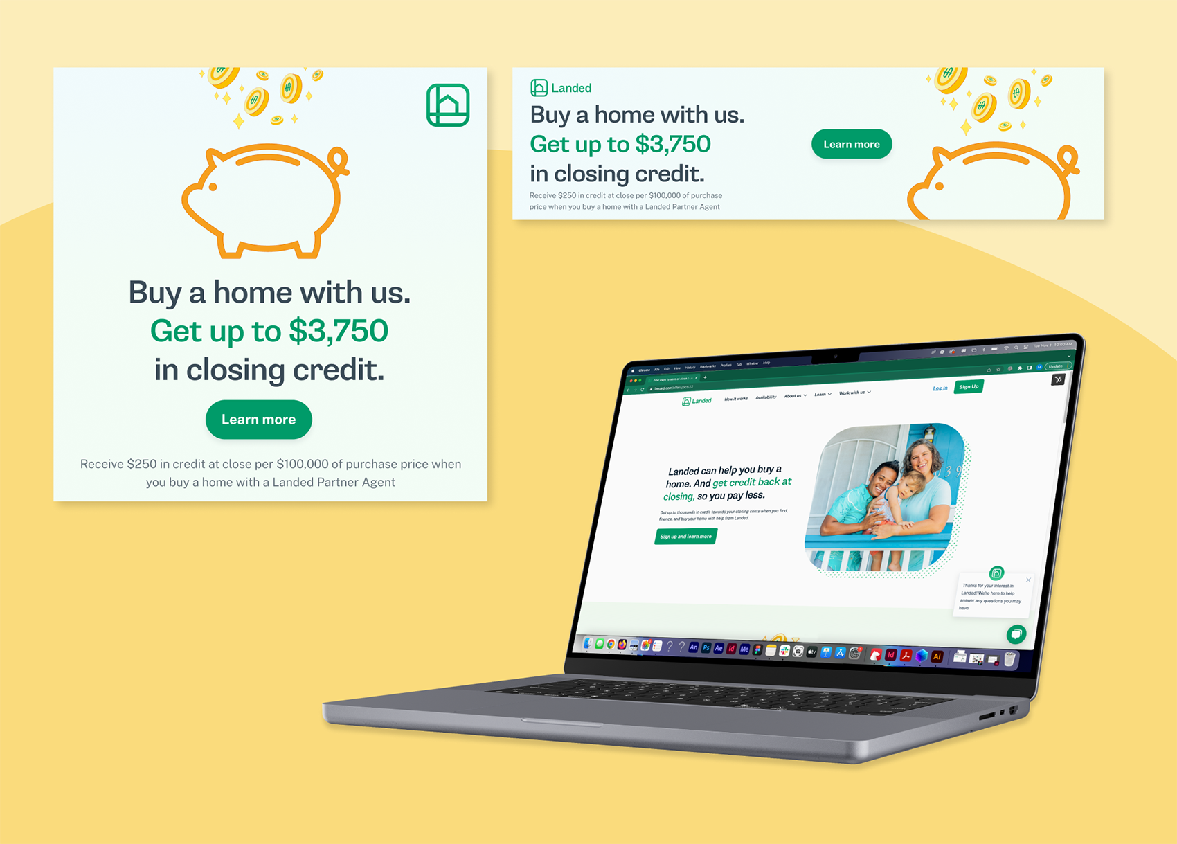
I executed on the design, editorial, and strategy for this marketing campaign. Marketing wanted to launch a promotion in order to drive more conversions, so I designed banner ads and a landing page to support that strategy. While the number of signups was short of our target, our series of content experiments (i.e. changes to the editorial framing, the position on the page, and more) gave us valuable data for future campaigns.
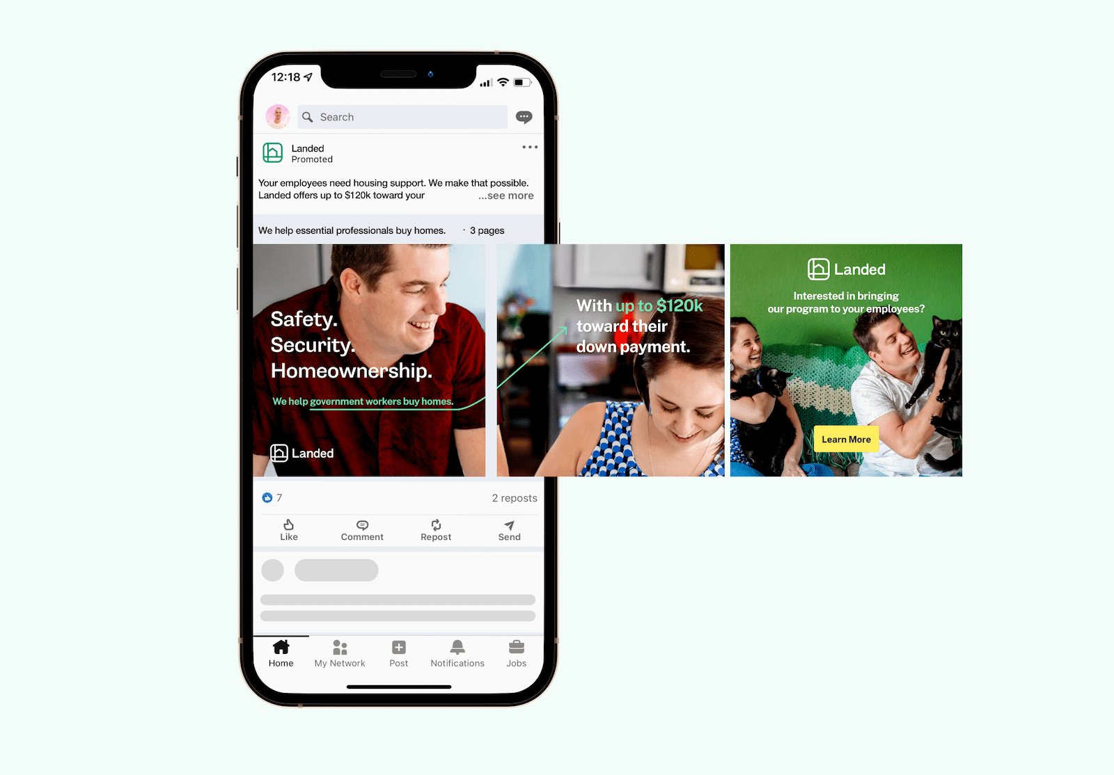
I wrote copy and designed visuals for this carousel (above) and video (below). Both assets were part of a larger B2B marketing strategy, which we unfortunately had to cancel early due to changing economic conditions.
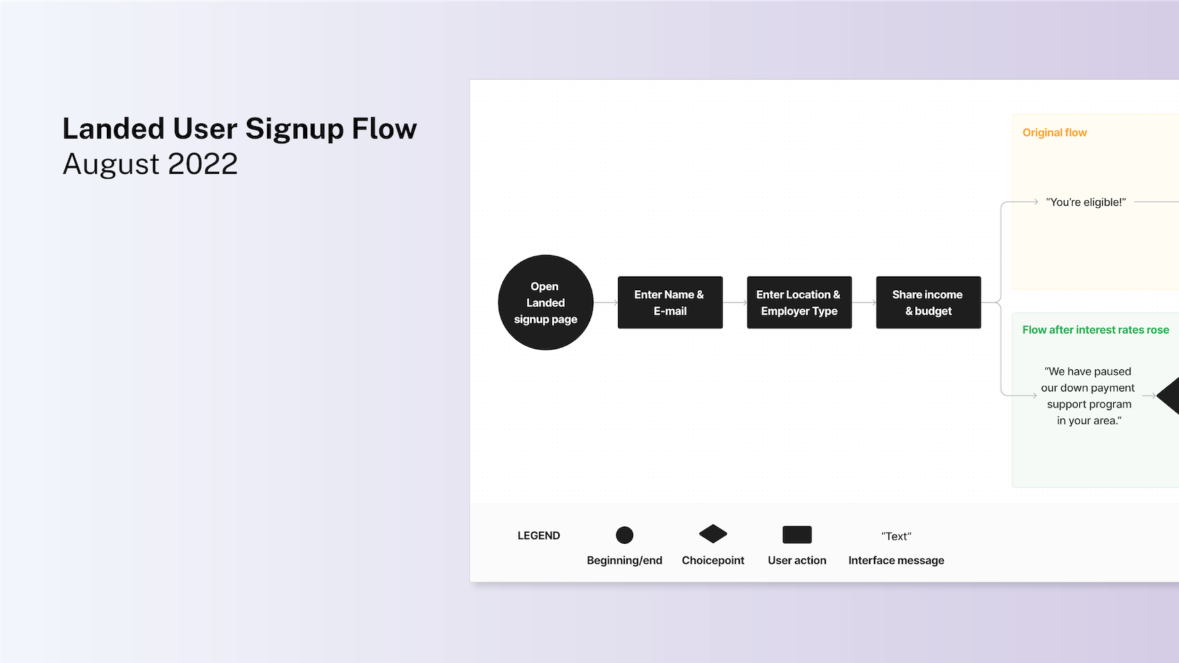
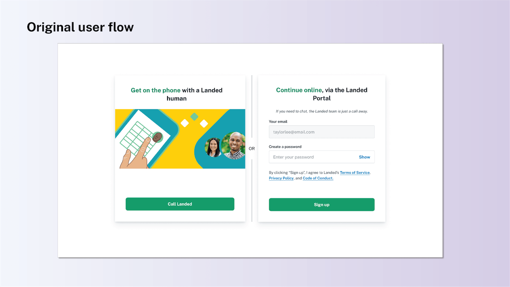
The marketing campaigns above all drove conversion on the product below: our onboarding flow for new customers. The tone and tenor of this flow had to change significantly after we ran out of funds for our down payment program.
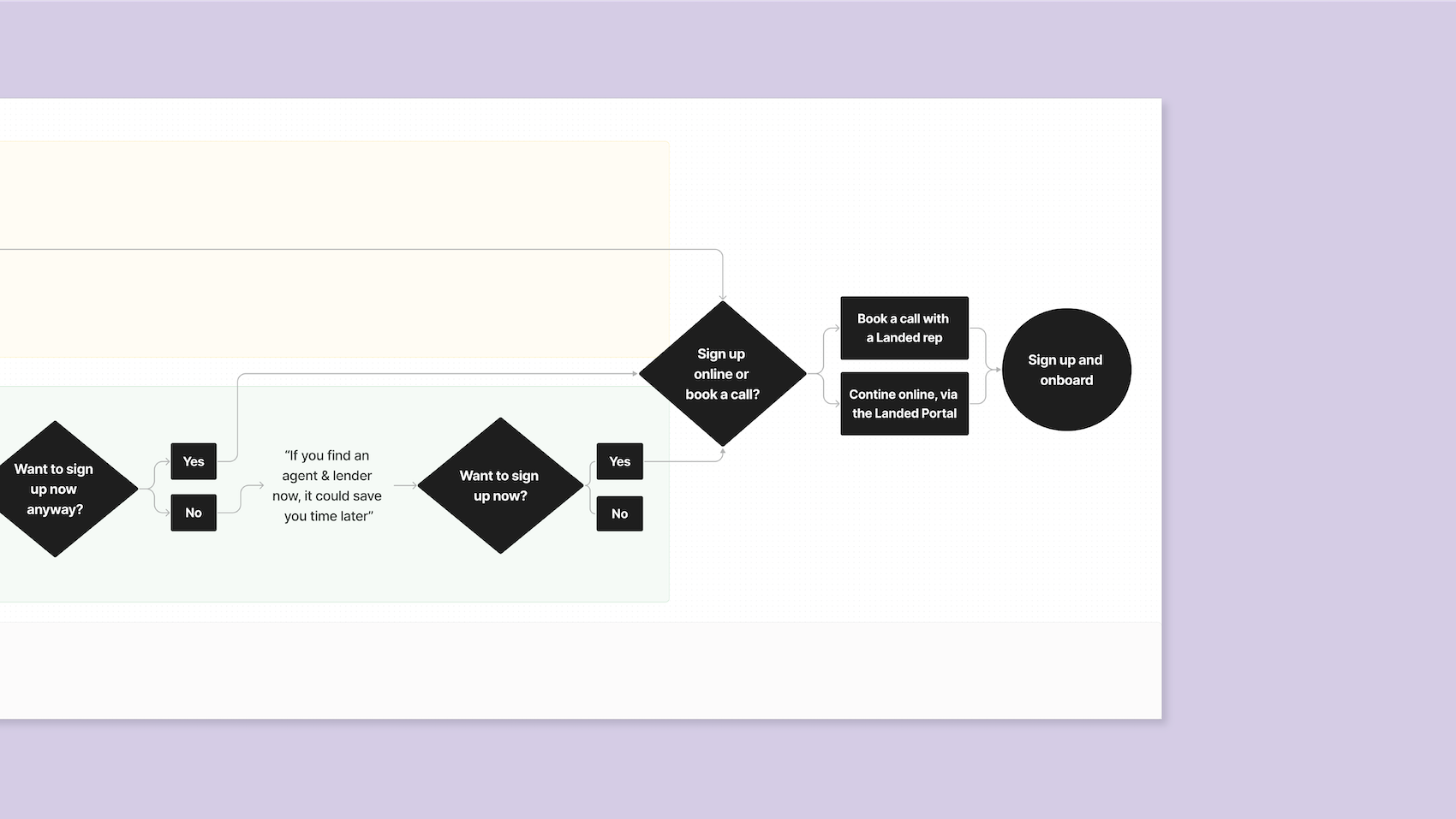
Originally, our chociepoint page below invited users to onboard either by giving us a call or signing up online (left image in slider). When we paused our down payment program, I gave this page a facelift (right).
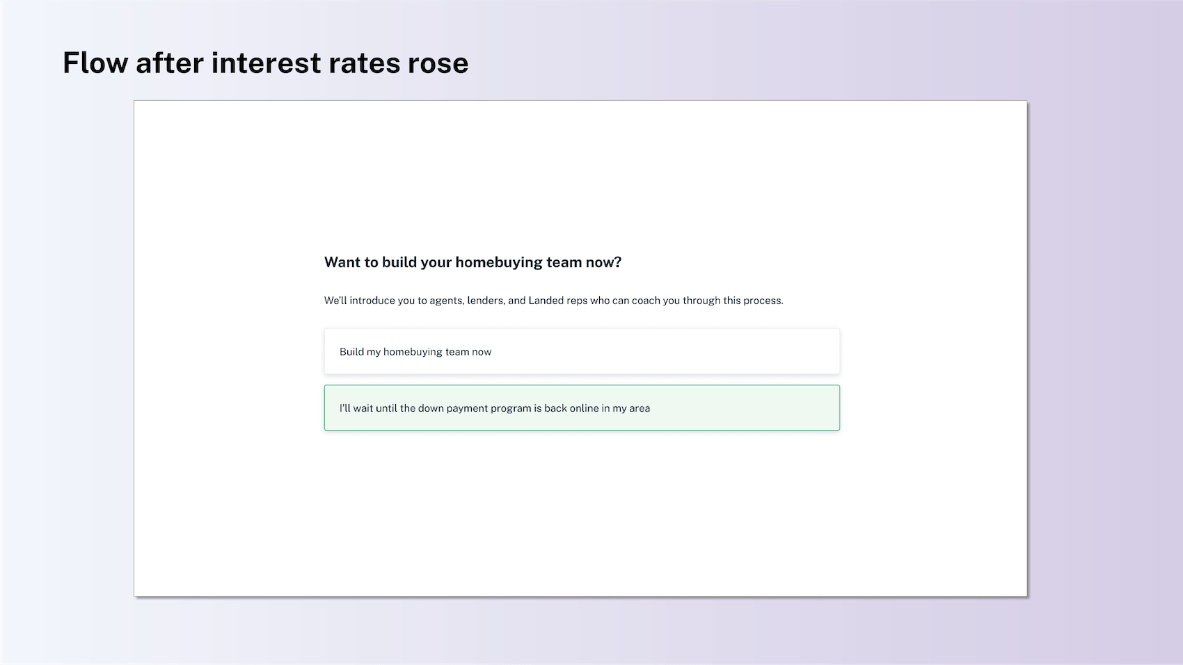
I revised our choicepoint page so that it would balance the needs of the business and those of the user. The business goals here are signups and, ultimately, conversions. The user, however, likely is learning for the first time on this page that our core product (up to $120k in down payment support) is no longer available. Bad news for most homebuyers, and not what they expected to hear from us.
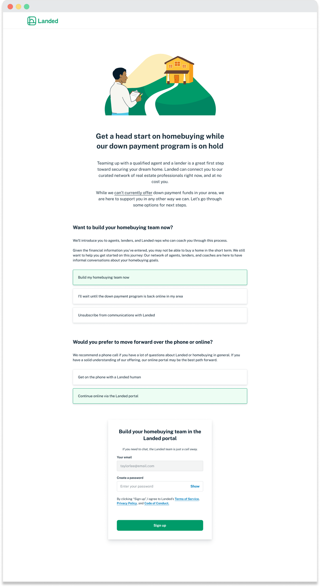
I anticipated mixed emotions at this news — sadness, anger, even despair — and decided our original choicepoint page was insensitive in the current environment. Rather than push signup on the user immediately, I revised the flow to ask questions: “Given the news about our down payment program, would you still like to sign up?”. If they answered “no”, the next question asked for confirmation of that choice.
Keeping business needs in mind, that second prompt also noted that, while our down payment program was on hold, if a user decided to build their homebuying team today, it may save them time later. This structuring allowed Landed to be sensitive to the needs of disappointed users while still pushing toward our conversion/onboarding objectives.
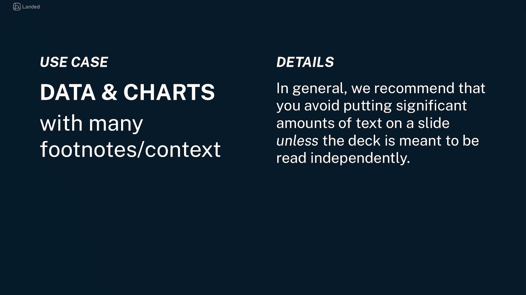
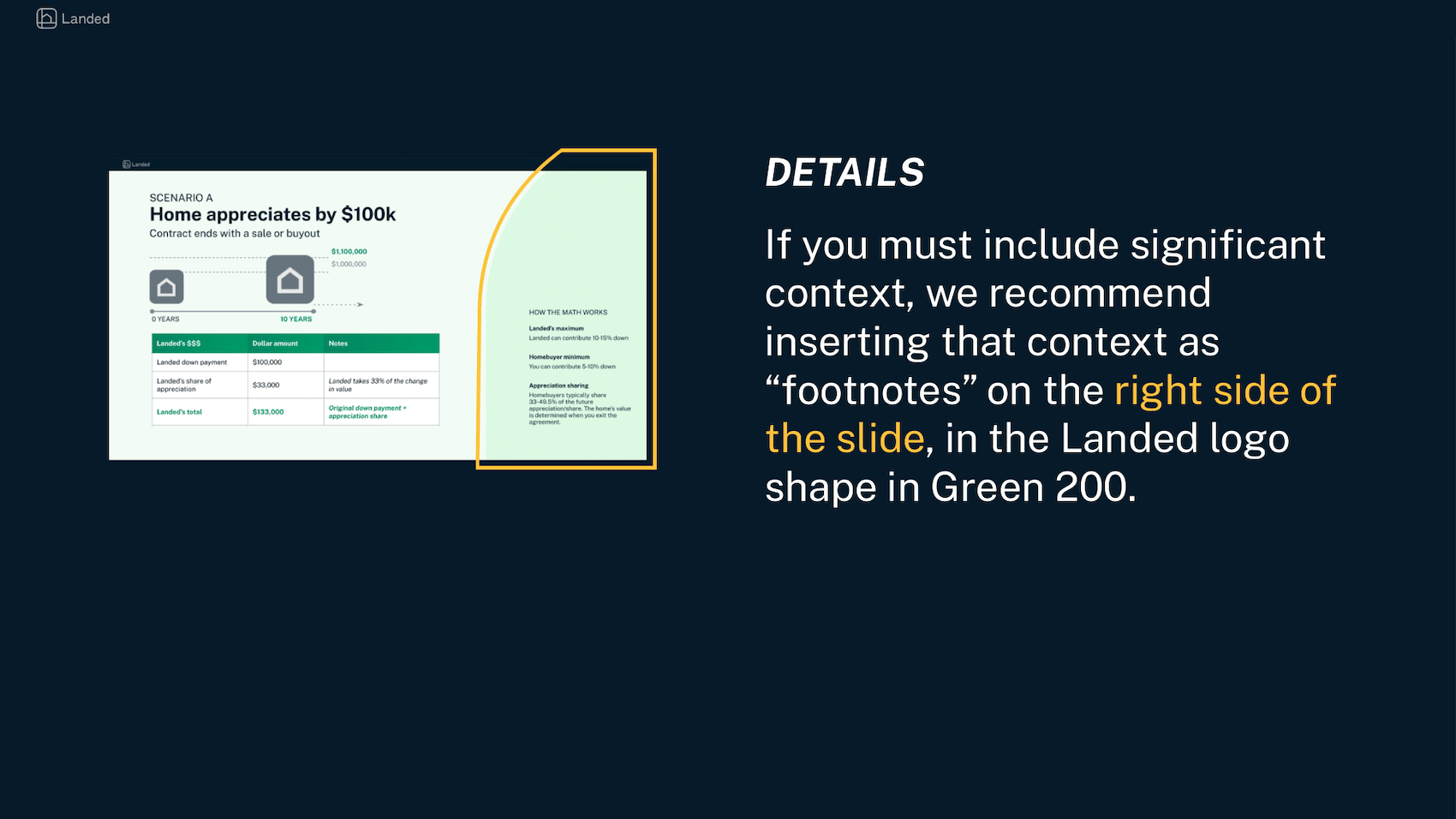
I defined the identity of Landed’s decks, for internal presentations as well as investor pitches.
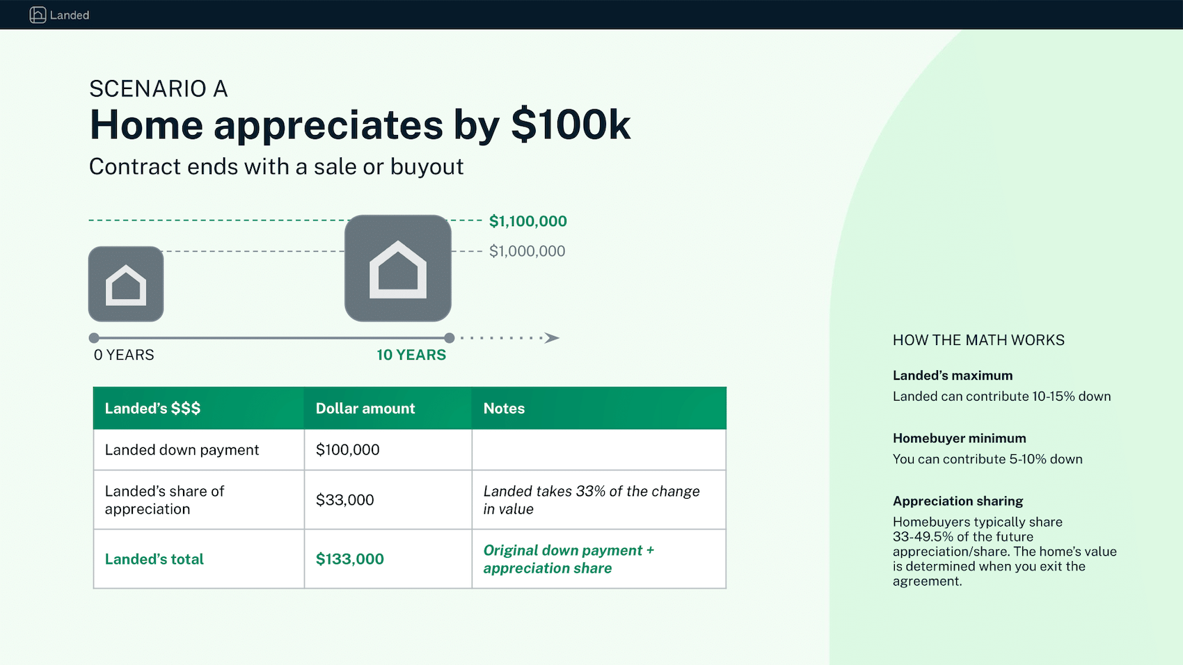
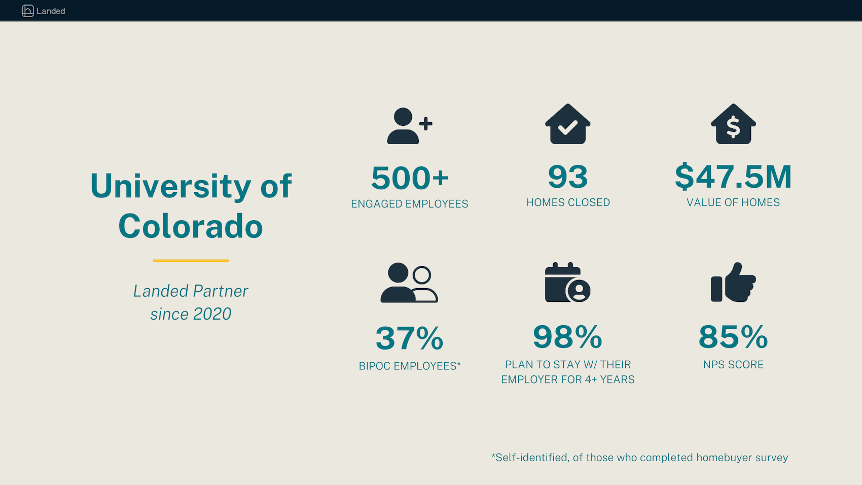
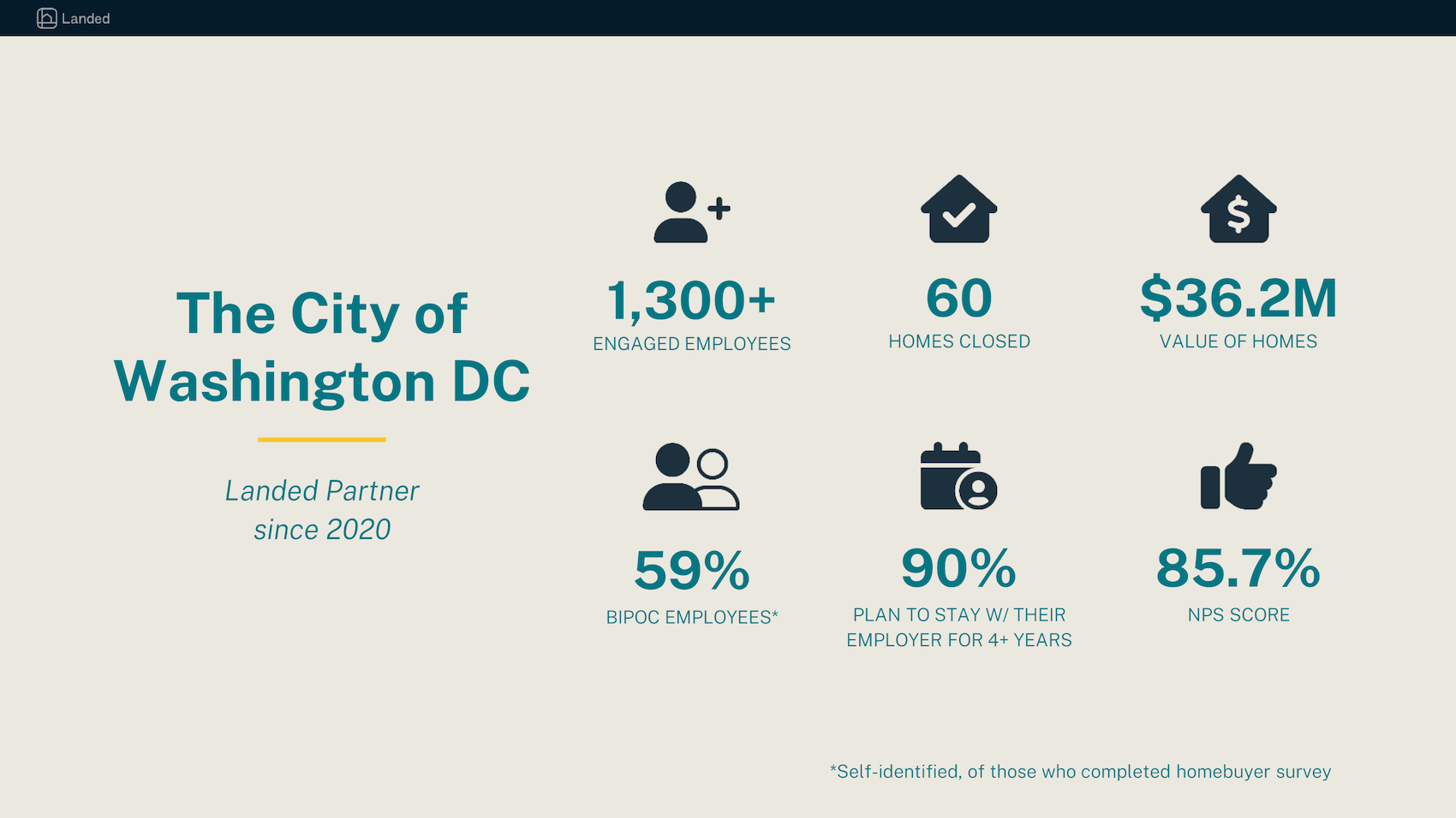
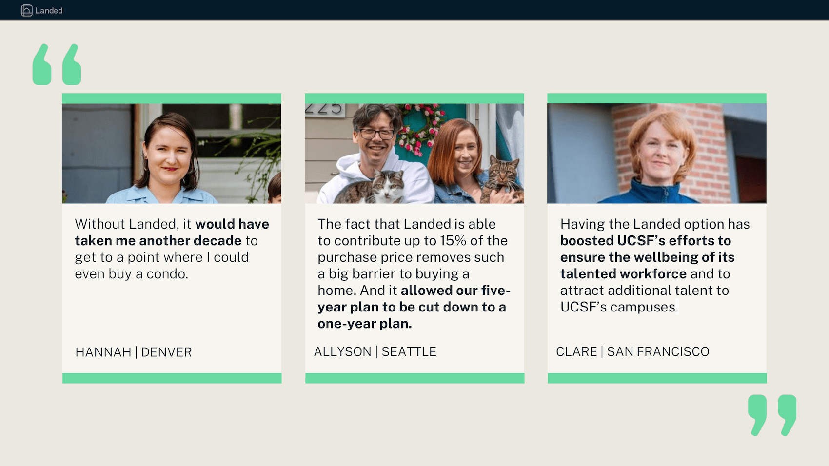
I prepared the deck below for a company founder and a sales rep. When Alex, our founder, shared the deck around the company, teams around the organization praised my designs for pushing the brand forward.
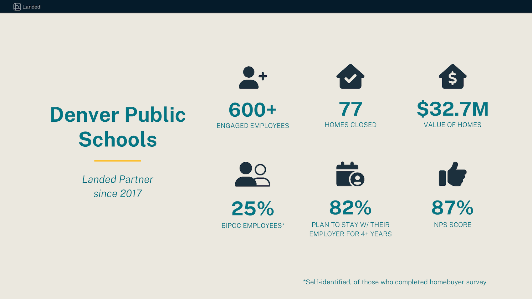
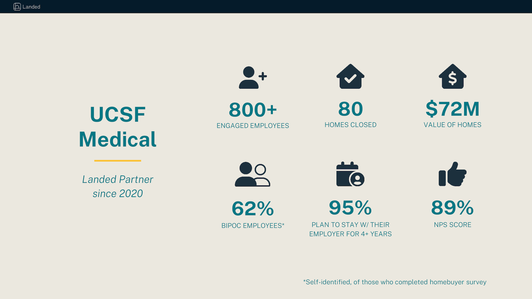
A teammate said the following of my work: "This is the most compelling and digestible format I have seen for our partner case studies—and, is a subtle flex on the strength of Landed's data capabilities, which is a huge value add to our partners. Love to see this amplified, and in a way that is more 'show' than 'tell.'"
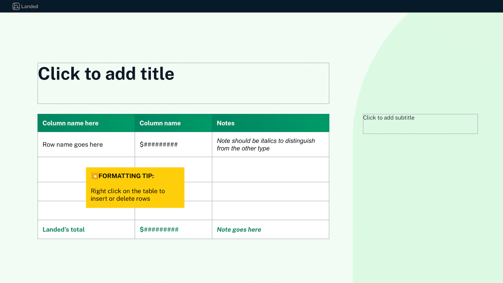
As more and more teams asked for my support on presentation decks, I also took on a project to empower non-designers at Landed. I created a Google Slides template that was both visually beautiful and as flexible as possible.
As this template was distributed around the company, I saw some of my designs replicated half a dozen times—therefore helping enforce a consistent brand identity even while my team of three was constrained by very limited resources.